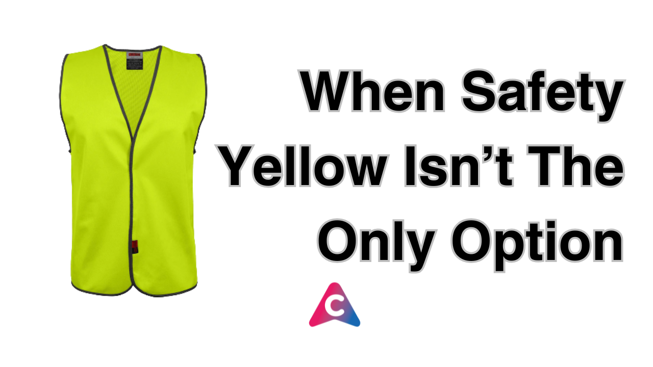
For decades, fluorescent yellow has been the default colour for safety, signaling caution and maximising visibility in low light. It works and it’s effective.
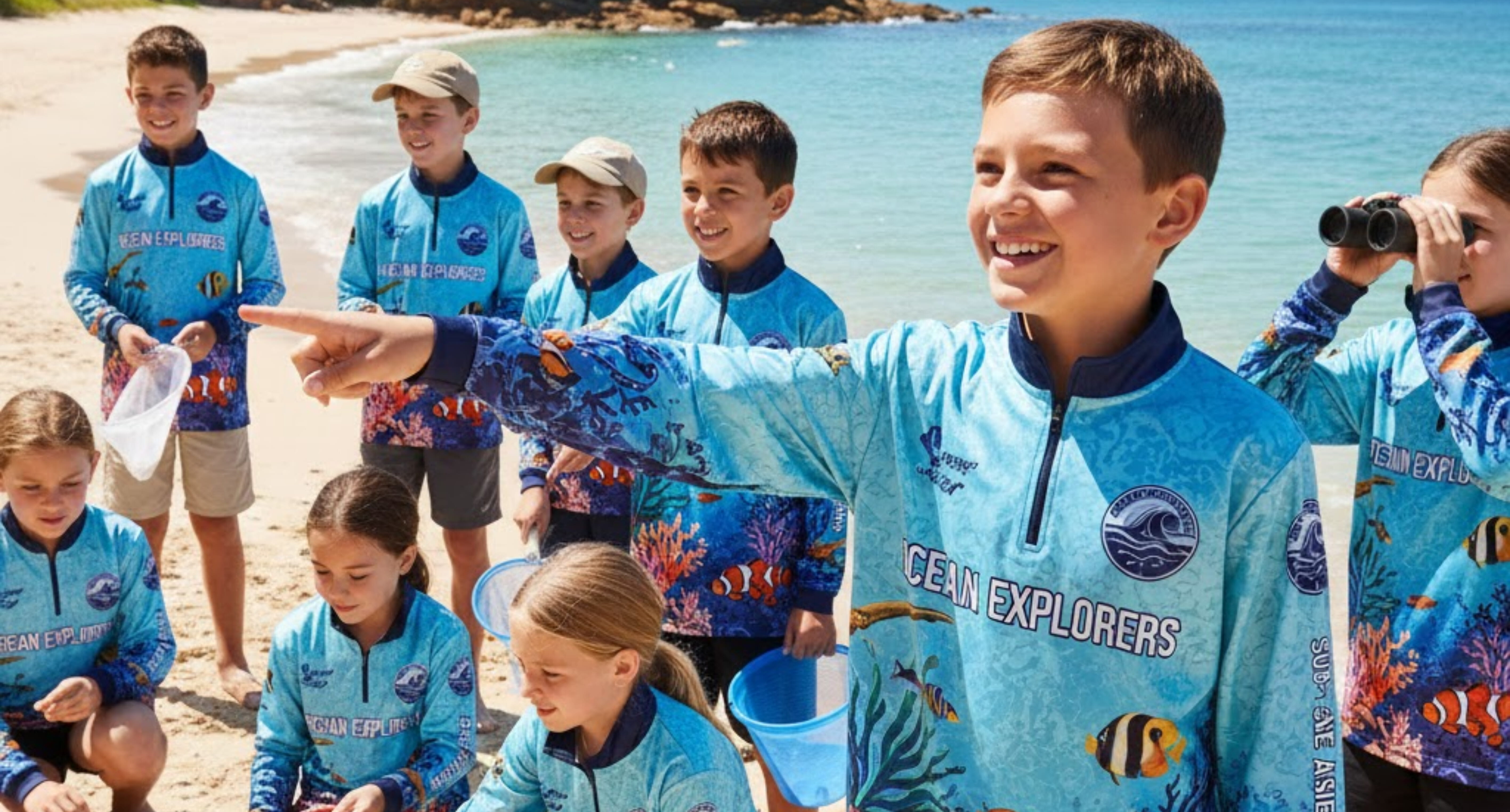
However, for a youth or community organisation, choosing a uniform or branding colour is about more than just roadside visibility. It’s a strategic decision involving identification, group cohesion, psychological impact and visibility in specific environments.
Ditching the idea that you must use safety yellow opens the door to a more informed, science-backed colour choice that better serves your group's unique needs. This guide dives into the science of colour to help your organisation make a smarter, safer choice.
1. The Science of Visibility: Contrast is King
While yellow is the most visible single colour on the spectrum (due to its high luminosity), its effectiveness is entirely dependent on what it is seen against. This is the fundamental principle of contrast.
For youth groups operating in diverse environments—from grassy fields to busy urban centres to crowded indoor play areas—a single colour often fails to provide maximum visibility everywhere.
| Environment | Optimal Colour Strategy | Scientific Rationale |
|---|---|---|
| Grassy/Natural Areas | Electric Pink, Bright Orange, Royal Blue | These colours provide maximum chromatic contrast against the dominant green (chlorophyll) and brown (soil) backdrops. They break the natural colour scheme. |
| Urban/Crowded Areas | Bright Yellow, Neon Green, Electric Pink | These fluorescent hues increase conspicuity in visually cluttered environments, as they appear brighter and more active to the human eye, capturing attention quickly. |
| Indoor/Visually Busy | Purple, Teal, Darker Blue (with bright logo) | Indoor environments often feature primary colours (red, yellow, blue). Using a contrasting secondary colour (like a deep, vibrant purple) can make a group stand out against generic play equipment. |
The Takeaway: Instead of a single "safety" colour, choose a primary uniform colour that contrasts sharply with your most frequent operating environment.
2. The Psychology of Colour: Building Identity and Trust
Colour doesn't just attract attention; it evokes emotion. When youth wear their group colours, it should foster a sense of belonging, energy and trust.
- Sunshine Yellow & Orange: These warm colours are often associated with happiness, optimism and energy. Research shows children (especially younger ones) have overwhelmingly positive reactions to bright, warm colours, making them excellent choices for building a welcoming, enthusiastic identity.
- Blue: Globally, blue is associated with trust, stability and reliability. For organisations focused on mentorship or sensitive community work, a bold royal or electric blue can convey professionalism and calm, crucial for earning parental confidence.
- Green: While blending in with nature, a vibrant, modern lime or neon green signals growth, nature and health. It's a strong choice for outdoor-focused groups like scouting or environmental clubs.
- Red: Used sparingly and purposefully, red conveys energy, passion and urgency. While too much red can be associated with danger (caution), it's powerful when used as an accent on a badge or logo to denote strength and leadership.
By choosing a colour that aligns with your organisation's mission and the emotional response you want to elicit, you strengthen your brand and group cohesion.
3. Dual-Colour Strategy: The Smart Compromise
The most sophisticated and safe organisations utilise a dual-colour approach:
- Primary ID Colour: A vibrant hue (Blue, Green, Pink, Orange) that defines the group's brand and is psychologically engaging.
- High-Conspicuity Accent: The intentional use of a complementary (opposite) colour on the colour wheel for maximum contrast in areas where safety is paramount.
For example:
- An Outdoor Club uses Electric Blue uniforms (for trust/stability) but accents them with a Neon Orange trim or logo patches. Blue and Orange are complementary, creating maximum visual pop.
- A Mentoring Program uses Deep Teal (for calm/depth) but uses a Neon Pink zipper or hood lining for instant identification in a crowd.
This strategy ensures both strong brand identity (psychology) and maximal visual conspicuity (safety) by leveraging colour science.
Final Selection: More Than Just a Hue
When selecting your colour, consider these practical, science-based elements:
- Fluorescence: Choose fluorescent (neon) dyes when possible. They absorb UV light and re-emit it as visible light, making the garment appear brighter than a standard pigment, dramatically increasing visibility.
- Colour-Blindness: Avoid relying solely on a red/green distinction. Blue and Yellow are much more reliably differentiated by the majority of colour-blind individuals, making their combination (or use as distinct colours) more accessible and safe.
- Reflectivity: Regardless of the colour chosen, ensure critical zones (sleeves, back) incorporate retroreflective materials for safety in low-light conditions, as they reflect light directly back to the source.
By moving beyond the single, traditional safety yellow and applying the principles of contrast, psychology and dual-colour strategy, your youth organisation can choose a customised colour solution that is not only safer but builds a stronger, more positive identity for every member.
Take Your Club's Kit Knowledge to the Next Level
We hope this science-backed guide helps your club keep its whites looking impeccable all season long. But the relationship between science, branding and customised club apparel goes far deeper than just laundry.
If you’re genuinely interested in the competitive edge that comes from understanding fabric technology, colour psychology and the scientific rationale behind successful custom clothing and branding, we invite you to take the next step.
'The Thread' is our exclusive monthly newsletter dedicated to uncovering the deep science behind premium customised apparel. Every issue delivers research-backed articles on:
- The chemistry of durable colour application.
- Advanced fabric choices for performance and longevity.
- How branding impacts club identity and recruitment.
Stop guessing about your kit. Start knowing. Subscribe to 'The Thread' today and get the cutting-edge knowledge your club needs to look, feel and perform its best.
Until next week.
Team Colour Up


